Wednesday, June 30, 2010

Week 7: St. Johns County, FL home site selection

The attached maps and PowerPoint presentation are a part of a set of GIS analyses intended to help two new Florida residents to identify the part of St. Johns county in which to purchase a home. The decision is based on distance from Ponte Vedra Beach, Flagler Hospital, proximity to horse farms in rural or low density areas, and census tracts with median age 40-50. A weighted overlay of the selected parameters was intended but technical difficulties on the Terminal Server prevented this action.


PowerPoint Presentation

Tuesday, June 22, 2010

Week 6: Homing in on Alachua County, FL

This blog contains three maps and a hyperlink to a Project Summary. The first map shows a base map for Alachua County including places, roads, and recreation areas.


The second map layout shows four map insets that delineate Euclidean distances from the North Florida Regional Medical Center and University of Florida, Percentage of population in 40-49 year age range (by census tract), and median house value (by census tract).


The third map shows the weighted overlays for ranking of the four house selection parameters. In the first case, the four parameters were assigned equivalent ranking (25:25:25:25), while in the second case, the Euclidean distances to the hospital and university were each assigned a ranking of 40% and the two other parameters were each assigned a ranking of 10%.


Project Summary

Here are modifications of map 2 and map 3 to be more "colorful". Initially, I created the maps to follow a color trend (an intensity ramp), but I wanted to try this to for effectiveness.


Tuesday, June 15, 2010

Week 5: Optional 3D Exercise

Attached is a 3D presentation of a university campus. It was produced using ArcScene after activating 3D Analyst. Photos are linked to this map but are not readily accessible through the Terminal Server....I was able to activate the photos with the hyperlink code using my compuer version of 9.3.1, however, my version did not include the 3D Analyst extension, so I had to transfer over to the Terminal Server.

Friday, June 11, 2010

Week 5: Urban Planning and Environmental Impact

The following three maps resulted from completion of the ESRI Module 5 content of the Urban Planning and Environmental Impact Assessment course. The first map is an Environmental Impact Assessment (EIA) for Pewter City


This map examines assessment of various industries on a regional economy by calculation and presentation of a parameter referred to as the Location Quotient (LQ).


The final map examines the housing that is available for student occupancy in the region and it examines the resulting student occupancy rate by looking at four different housing types in which students will live and the parcels where this housing occurs.

Thursday, June 10, 2010

Week 4: Oil Spill Animation

Attached is an animation of the movement patterns of the Deepwater Horizon Oil Event from April 29, 2010 to May 26, 2010. The avi file was produced using 6 layers (polyline and polygon, both) with the ArcMap Animation Tool. Reference was made to finder.geocommons.com to examine the growing ability for the general public to participate in geospatial database processes (i.e. map making, database management, and data evaluation/presentation).


Deepwater Horizon Oil Event Animation

Summary on the Role of GIS in disaster response (specifically the Deepwater Horizon Oil Event)

Geographic Information Systems may be employed to forecast and hindcast cause-effect relationships for circumstances related to human society and to those associated with the environment. GIS has become a critical tool in disaster characterization and assessment. In the first phase, GIS can be used to identify the extent and magnitude of impact including the range extent of impact of a natural disaster on a region but also the relativization of that impact. Once the spatial extent of impact has been determined, GIS can be used to make guiding decisions about the optimum approaches to implement an emergency response plan so that response personnel can optimally enter into the "event zone" to tend to victims and to respond to secondary damages (i.e. fires or gas leaks from an earthquake, or sewage or oil contamination from a flood, etc.). Finally, cost estimates of the disaster can be determined with GIS. This helps insurance adjusters make informed decisions about damage estimates and it helps local, state, and federal agencies make guiding decisions about the resources that will need to be allocated to the "event zone" to aid a speedy economic recovery.

Regarding the Deepwater Horizon Oil Event, GIS has aided investigators and responders to characterize the extent of the oil spill and it's transformation over time. This becomes particularly important when the continual discharge of oil complicates this dynamic catastrophic event. Further, GIS helps emergency response personnel identify sensitive coastal zones and specific habitat types that require heightened remedial action. Predictive modelling may then be used to forecast various scenarios that incorporate water circulation patterns in the Gulf of Mexico and the Atlantic Ocean, and seasonal tidal and weather patterns that may exacerbate the impacts of the buld oil delivery to sensitive areas. Finally, GIS can be used to characterize the economic impact of the oil spill on the Gulf states ranging from the cost of recovery efforts to the cost of damage to property and, in the long-term, to the cost based on the loss of critical industries (tourism, fishing, shell-fishing, oil production, etc.).

Week 4: Deepwater Horizon OIl Event maps

The first map is a Google Earth compatible image of the fishing closure area for the end of May, 2010. This zone delineates the region most notably impacted by the Deep Horizon Well Oil Spill in the Gulf of Mexico.


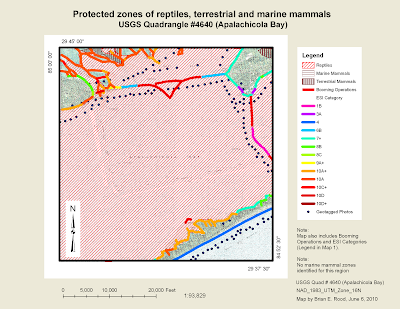
The following three maps identify booming operation and "most sensitive" shoreline zones based on the Environmental Sensitivity Index (ESI).


Tuesday, June 1, 2010

Week 3: Coastal flooding from Hurricane Katrina

The exercise examined the physiography of three Mississippi counties (Hancock, Harrison, and Jackson) and the storm surge that resulted from Hurricane Katrina. After reviewing the metadata for the various layer files in the katrina.gdb geospatial database, the map projections were all based off of the landcover raster layer of the katrina.gdb files. The Environments were set with the current workspace being set as Katrina.gdb and the scratch workspace being set as project1_results.gdb. The Output Coordinate System was set as "Same As Display" and in the Raster Analysis Settings, the Cell size was set to 30 and a Mask was set to the Counties layer from the Katrina geodatabase.

Deliverable 1: Physiographic map of three Mississippi counties

In the first map, the Elevation raster layer was initially calibrated in metric units so the layer was transformed to "US"-units (feet). The color scheme for the resulting transformed Elevation layer was set to a yellow to dark green color ramp.


Deliverables 2 and 3: Map of flooded land of the Mississippi coast after Katrina and a bar graph showing percentage of total flooded land by land-cover type.

The next step was to reclassify the types of landcover types into a smaller number of generalized categories. Once the landcover types were characterized, they were matched with the land area that was affected by the Katrina storm surge (15 ft above sea level). Of the land that was affected by the storm surge, we identified the relative percentages of each landcover type that was affected by the flooding. A table was generated.


Deliverable 4: Map showing infrastructure and health facilities at risk from the storm surge.

The next step was to identify infrastructure (major roadways and railroads), hospitals, and churches in order to identify those constructs that would be affected by another Katrina-like storm surge.


Deliverable 5: Map and table presenting the calculated area (acreage and square miles) that was flooded by the Katrina storm surge

The final map and table show a calculated area in units of acres and square miles that were flooded by the Katrina storm surge. These data were determined for the different land cover types established in Deliverable 2 and 3.

Week 1-2: Earthquakes

New Madrid Earthquake


Northridge Earthquake